Heartline — Making Real Friends Without the Awkwardness
Heartline is a low-pressure social interface prototype designed to help Northeastern students bridge online discovery into real-life meetups, reducing awkwardness and emotional risk through trust, clarity, and interest-based connection.
1) Problem & Why it Matters
Students are physically surrounded by peers yet still experience loneliness and social anxiety. Many platforms encourage performance and passive connection rather than genuine in-person friendship.
- Design goal: reduce social “activation energy” to start a friendship
- Principle: psychological safety + low cognitive load
- Bridge: discover → invite → meetup (low-stakes)
2) Approach
We focused on reducing hesitation and uncertainty before a user takes social action. That means clear next steps, trust signals, and low-pressure group entry rather than forcing one-on-one cold approaches.
- Trust: identity verification + mutual acceptance before chat
- Discovery: nearby users and interest-based groups
- Coordination: map-based meetup context
3) Needfinding & Task Analysis
Task analysis revealed much of the “work” happens before anyone speaks: scanning, risk evaluation, and fear of embarrassment. We designed the interface to intervene early by lowering emotional barriers and decision fatigue.
- Requirement: reduce perceived emotional risk when initiating interaction
- Requirement: enable zero-prep participation (fast to first action)
- Metric idea: Time-to-First-Interaction (TTFI) + follow-through rate
4) System Concept
Heartline explores a simple structure: verified identity for trust, map-based discovery to make nearby connections actionable, and groups to reduce the pressure of one-on-one initiation.
- Verification: student ID/documents
- Map: nearby users + meetup context
- Groups: topic + capacity + location
- Communication: chat + voice
5) Low-Fidelity Prototyping
We translated early ideas into paper screens to quickly test the interaction flow. These sketches focused on the highest-impact actions: discovering nearby people, joining groups, verifying identity, deciding on location sharing, contacting another user, and managing an account.
- Discovery: map-based browsing of nearby users and shared interests
- Connection: low-pressure actions (Join, Chat, Voice)
- Trust: student verification and location-sharing decisions
- Coordination: route/map concepts for meetups
- Control: settings and contact list for longer-term use
Why Lo-Fi mattered
Lo-fi helped us spot hesitation points before investing in hi-fi visuals. It also helped validate whether the product still felt “low pressure” while supporting real-life meetups.
- Clarity: do users know what to press next?
- Trust: do users understand verification/location implications?
- Discoverability: can users find map, groups, and actions quickly?
6) Low-Fidelity Prototype Gallery
Paper screens used to explore the core flow and test clarity, trust, navigation, and low-pressure interaction.
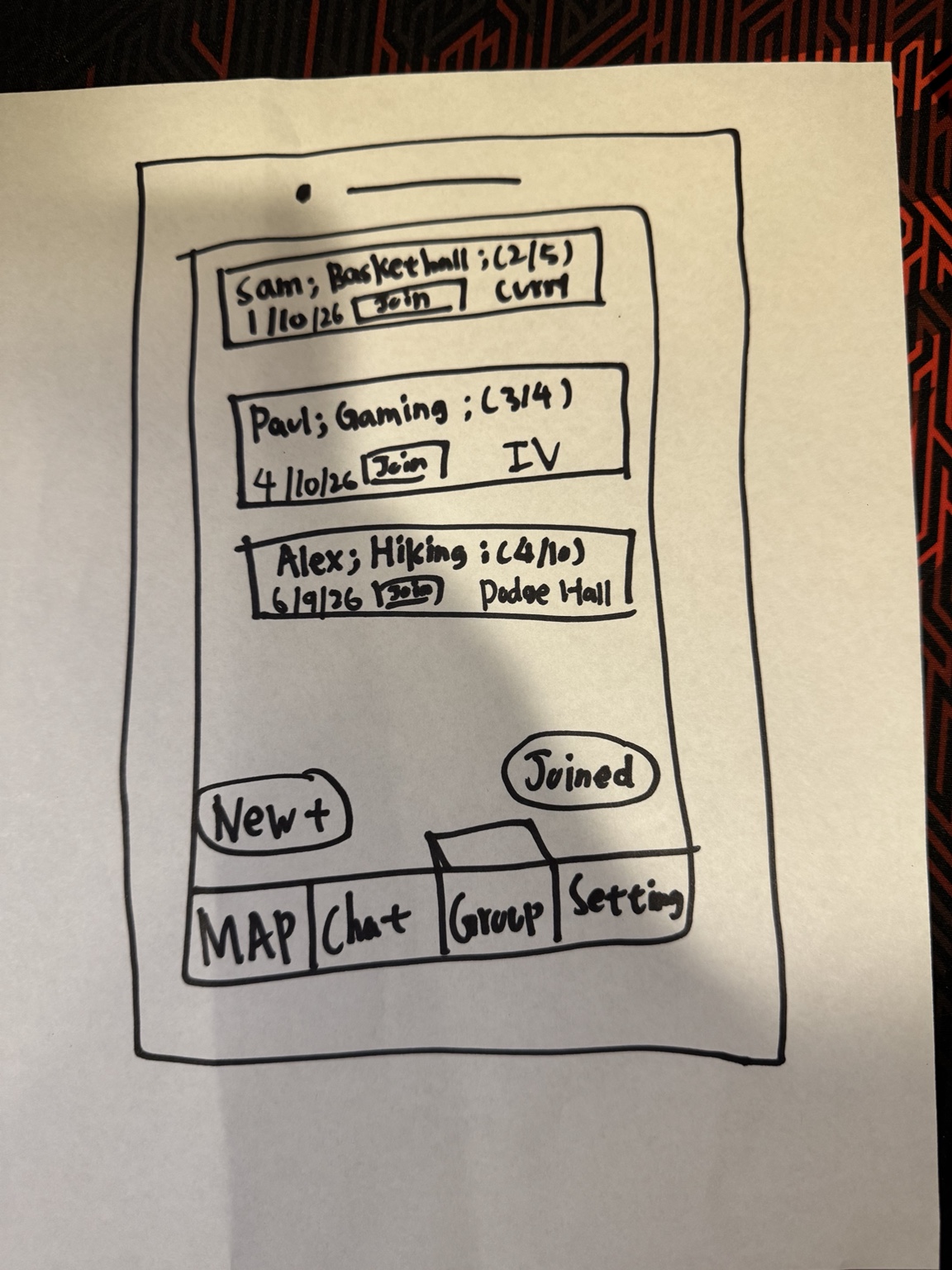
Early group list with “Join” and a concept for separating discovery (New+) from participation (Joined).
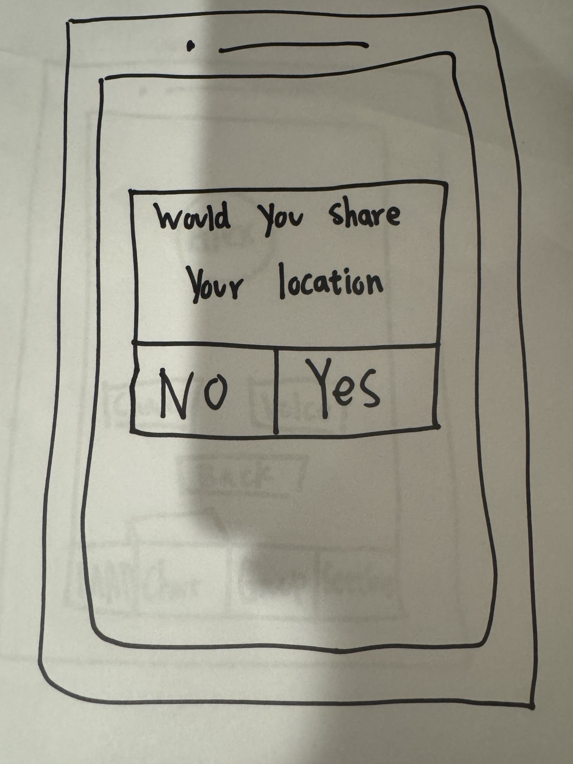
Early prompt for location sharing; connects directly to privacy concerns and the idea of “drop-a-pin.”
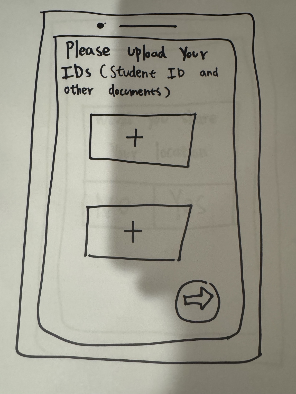
Student ID/documents upload as a trust mechanism; later iterations needed clearer expectations and progress feedback.
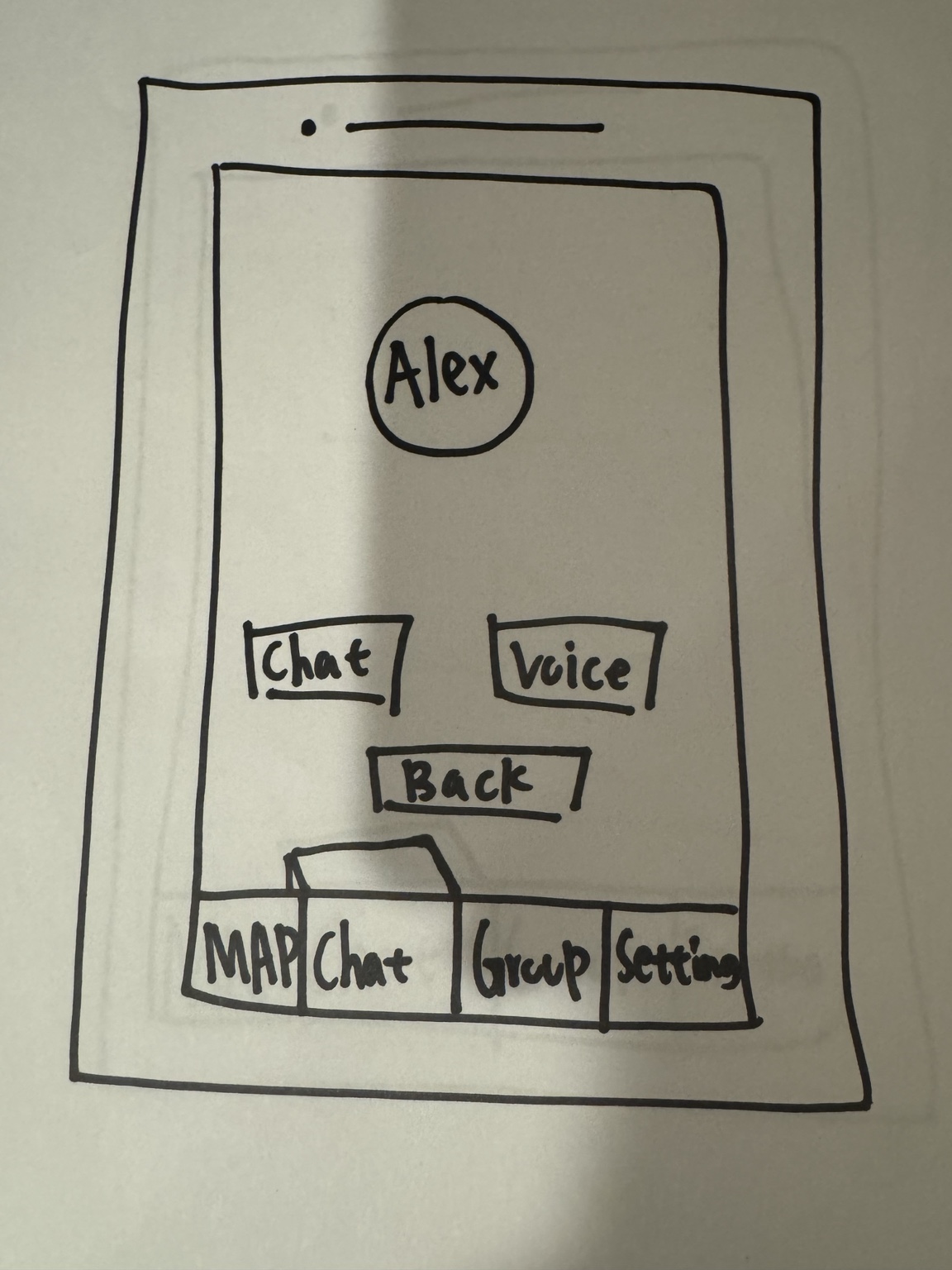
Simple, low-pressure next step after viewing a user: choose Chat or Voice.
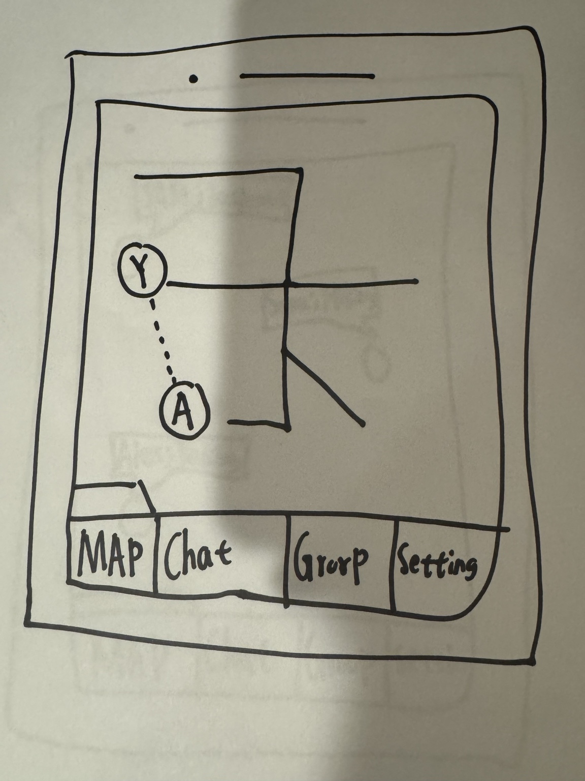
Explores spatial coordination for in-person meetups; later informed map clarity and interaction cues.
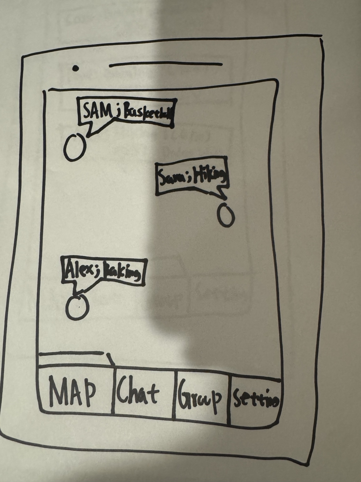
Shows nearby people and interests to help find shared-context connection opportunities.
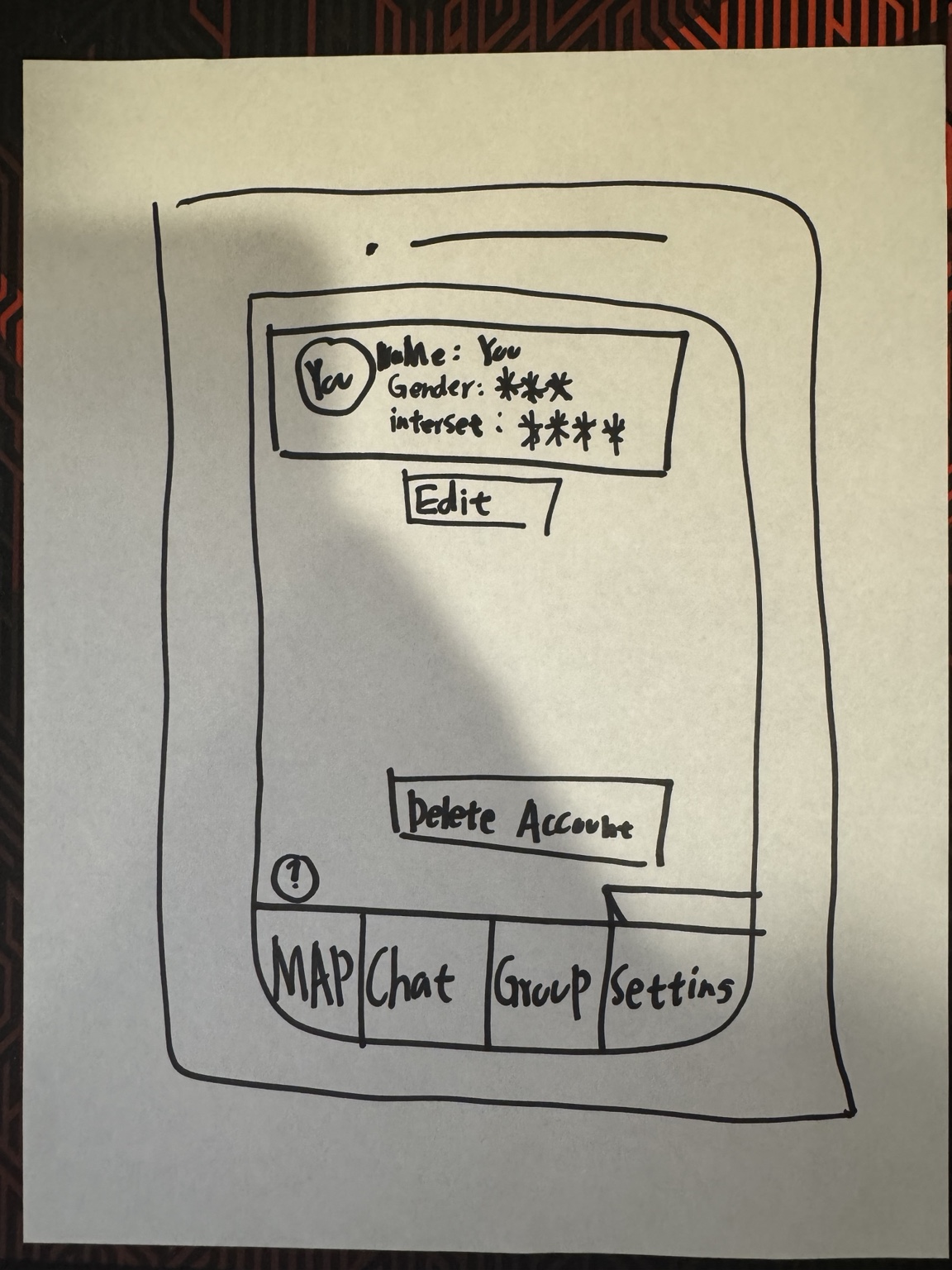
Edit profile and delete account concepts; supports transparency and user control.
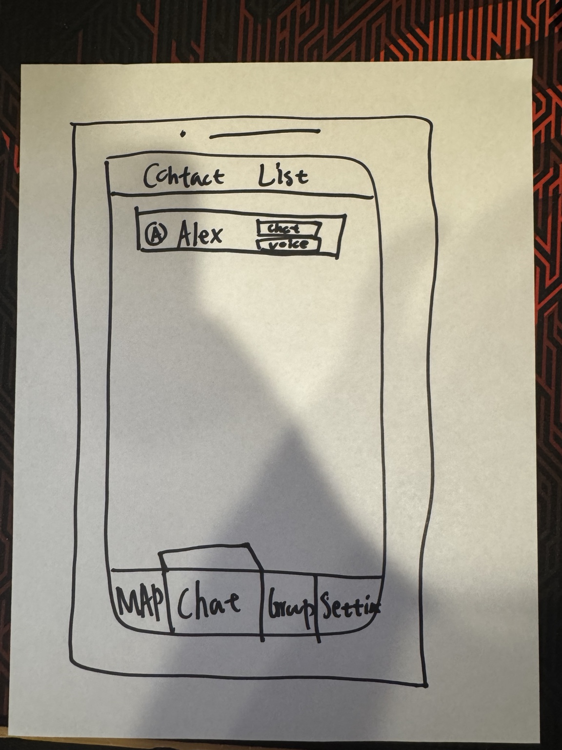
Quick access to established contacts with chat and voice actions—reduces friction over time.
7) Hi-Fidelity Prototype (Figma)
Embedded Figma prototype. If it doesn’t load, make sure Figma sharing is set to “Anyone with the link can view”.
8) Testing Findings
Low-fi and hi-fi testing surfaced consistent friction points: unclear feedback after actions, map/navigation ambiguity, verification expectation gaps, and missing discoverability cues.
- No feedback after actions: users unsure invite sent / group joined → confirmation states (✓)
- Navigation & map confusion: users tapped wrong tabs or didn’t realize map was interactive → onboarding cues
- Verification expectation gap: requirements felt sudden → clearer ID explanation + progress indicator
- Discoverability: missing/weak search and key actions → add search + clearer CTAs
- Engagement: group creation needed a clear CTA
9) Iterations
- Clarity & discoverability: stronger CTAs, improved profile hierarchy
- Trust & transparency: step-by-step verification flow + progress feedback
- Interaction & navigation: map cues (markers/hints) and improved tab structure
- Engagement: add search bar, “Create Group”, and separate New vs Joined groups
10) What’s Next
- Privacy-first location: switch to “drop-a-pin” visibility instead of always-on live tracking
- Onboarding: guided walkthrough/tooltips for map, invitations, and group actions
- Adoption strategy: pilot with freshmen/transfers during onboarding programs and campus events